Sewing and Technology
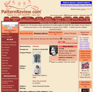
I signed up for PatternReview.com today (check out my profile!). Like it’s name implies it is a site where you can share finished projects of patterns and post reviews. Great idea, right? I like it because you can search for specific patterns which is difficult to do on BurdaStyle and you can see different versions of the same pattern in one place but already there are so many parts about this site that I dislike.
The user interface is weak (did I ever mention I work for a website? yeah, I take things like this seriously). There’s way too much text crowding the pages. After I signed up I never could find a link to post a review. I had to find a link from the help page and bookmarked it. Also, anytime I try to post anything it makes me re-log in over and over again. The ads are text not photos so sometimes I think I’m going to a content page but then I figure out it is an ad. Lame.
And then there’s the review itself – I can only post 1 picture. Lame. And then that picture isn’t even displayed in the window with the review. Lame.
Also searching for patterns is tedius and it is not clearly marked where you actually go to read the review. What do I click on?? Lame.
Anyone else use Pattern Review and have this many complaints? I do love that it has a very vibrant and active community and there is always something new to see but the site itself needs a major overhaul. I only posted two reviews and I’m already annoyed.
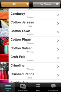
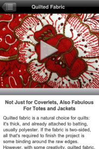
But to make up for the lameness of Pattern Review I downloaded Fabric U for my iPhone. It’s a great app featuring dozens of different fabrics with descriptions and pictures.
Oh so helpful when I’m at the fabric store or I’m looking at suggested fabrics for patterns online and I want to know what jacquard is. Especially good if you’re only moderately familiar with fabrics like I am and tend to stick to the same kinds over and over again and want to branch out. And it’s only $1.99. Definitely worth the money in my book. Anyone else have this app?


Hi Dixie, I’ve been enjoying your blog for a while now – I like your style! I have the same issue with Pattern Review. The concept is great but the whole design is just so awful I can’t bear to use it. I do look up patterns on it sometimes but haven’t posted anything myself as it’s just so horrible to use!!
Fingers crossed they can get it together and give it an overhaul.
Gah! You’re right. It’s not great!
Px
It’s an awful website. I discovered burdastyle first and then, despite reading about it on blogs, avoided patternreview for a long time. Eventually I realized that the actual pattern reviews are extremely helpful! You’re so right about it being unclear where one should even click to read a review.
Hello.
Lovely blog.
I found you in indie business.
I love your color scheme and style.
anna
haha, I’m glad I’m not the only one who feels that way about the site. but it is very useful if you can get around the disorganization of content.
anna, thanks for stopping by!
It is a confusing website, I thought it was just me and my computer illiteracy. It is worth all the frustration though for the info you can get from that website. I was having a problem fitting some pants so I posted it on one of their pages and I had so many people offer solutions within the hour. So my consensus is that it is a pain but worth it.
I love PatternReview for it’s a great resource and amazing community, but with regard to the design and interface it is awful indeed. I enjoy most their pattern, book, class and store reviews, and I also take online classes with some of the best industry experts.
I totally agree with you, I signed up for patternreview too just so I could see what others thought of patterns, but the website it terrible so I’ve never even tried to do more with it. I think they have an older demographic of sewers who just put up with it, while Burdastyle has a younger more internet savvy demographic so the interface matters more.
I really love PR. The hardest thing to find is “write a review”. After years on the site I now know it is found this way:
My Account, My Reviews (under Frequently Used Links), Add Review (under Pattern Reviews written by you:).
Yup, it takes that much effort. That aside, it is worth it. I love finding out what alterations to make on a pattern before starting. It’s my first muslin. lol
I really like the idea of the website, and I use the reviews a lot, but the site is not user friendly. I have never uploaded a review, simply because I haven’t found out how to! Also I don’t like that you need to upload a pattern picture, one for each pattern would be enough and the reviews can go from there.
There’s so much that can be done with the website to make it excellent!
I am so glad to see that I am not alone in my perspective of Pattern Review! When I started out in sewing I believe Pattern Review was the first real sewing site I visited and my first initial thoughts were: “Why is it so hard to search? Pages so busy? Bad photos? Bad layout?” And I still think of it that way to date.
Pattern Review is the best site to find information on specific patterns, but alas, it is like searching through your attic trying to find an old heirloom amongst an array of disorder.
I do hope they will revamp their site soon!
Rebekah
http://www.artandneedlework.blogspot.com
Wow, thanks for all the response everyone. Another thing I can’t figure out is why I can click on some pictures in reviews and why some other ones are unlinked thumbnails. Weird.
I’m also trying to find a way for my project picture to link to my flickr page rather than just the image. Since you can only have one project picture I’d like it to go to my flickr page so people can then see the other related pictures instead of only one.
I have a lot of work to do to understand this site!